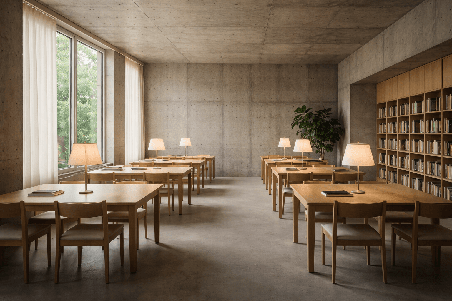
Calm media is a feature
A media site can feel trustworthy without being sterile. Calm is not a lack of personality. It is a decision to reduce friction.
A lot of media UI treats the reader like a distracted animal.
Everything shakes, slides, sticks, and demands attention. The result is not engagement. It is fatigue.
Calm design is a promise: the page will not fight you while you read.
That promise is built from boring things done well: stable layout, consistent spacing, and contrast that stays readable without hacks.
Calm also means predictable navigation. Back means back. Scroll means scroll. Nothing hijacks your input.
You can still have an accent color and micro-interactions. You just do not turn every click into a fireworks show.
Trust is mostly the absence of surprises, not the presence of effects.
If you want people to stay, give them clear headings, comfortable line length, and a layout that behaves like a chair: supportive, not performative.
In this demo, calmness is the product. The content exists to stress-test the UI.
Discipline is the hard part. Loud is easy.